Forms

Forms

A form provides the ability to collect information from your user community.

  1. The users' goal is to provide the information as quickly as possible it isn’t usually a task they want to do but one they need or have to do.
  2. The company's goal is to obtain the information

How good or bad your form usability is will be the link between successful or unsuccessful goals for both.
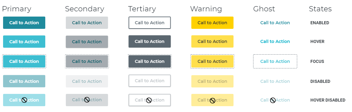

Usable Forms

Usable forms have both a relationship and a conversation


Relationship

Forms establish a relationship between the user and the company.

Users base Relationships on trust, and to create trust,

  • I research and understand the user's goals as well as my company's. Every form should have a goal that is user-driven.
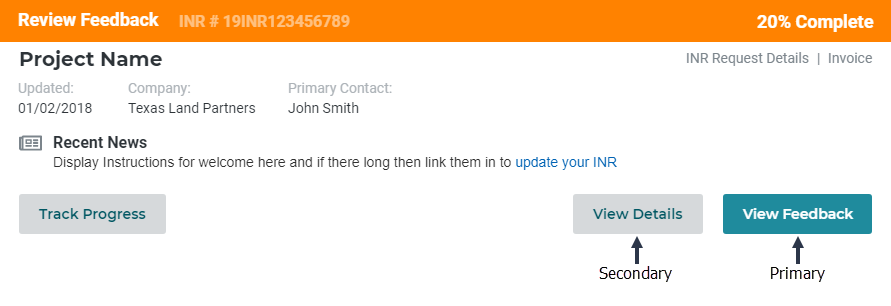
  • I provide a clean, consistent look and feel of a design system driven for a universal design language.
  • I challenge my companies users to ask for only the essential information. I am continually pushing back on stakeholders and business users to see if the information is required.
  • I make sure the form flow is timely, organized in an order that will be a natural flow for my users.

In turn, my users feel I took their interests into account and put effort into the information they provide.


The Conversation

They establish a dialogue between the user and the company.

A form is a conversation. It is the conversation between the company and its users. An employee shouldn't have to interview each user to obtain the information. The company creates a form to collect the data.

I view forms from this perspective and

  • I make my forms conversational and not interrogative I ask vs. demand answers.
  • I follow a natural order of a conversation. I ask my engineers how you would ask the user for this information to get the dialogue an engineer would expect.
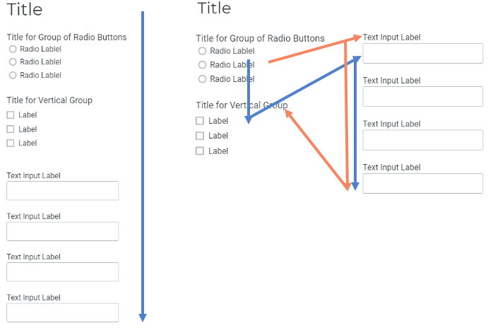
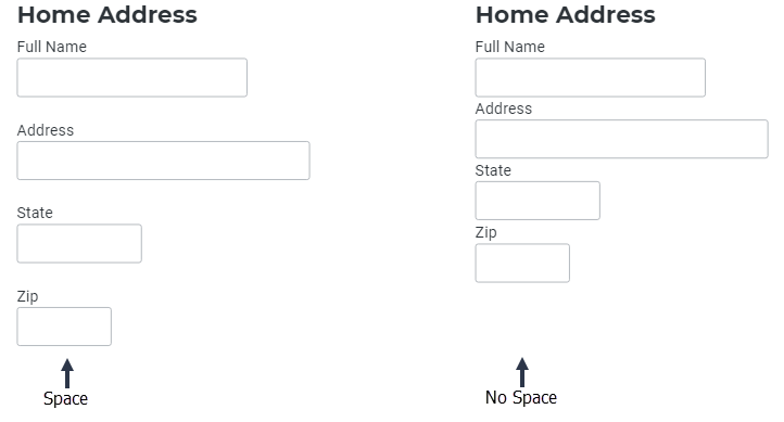
  • I group related information into sections, using whitespace as pauses in the conversation. And when a more significant break in the conversation exists, I break to a new page.
  • The section chunking and page breaking gives the impression the form is smaller and easier to fill in.
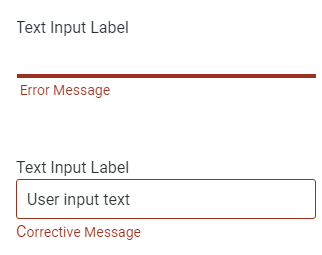
  • I address one topic at a time, making an effort to make sure each label and input does not make the user question the answer needed.
  • I don't use progress progression indicators on lengthy forms. It turns out to be more demotivating than motivating to finish a form. Instead, I offer easy ways to stop, start, and pick up where you left off in the conversation.

The Appearance

The appearance or user interface is central to the usability of a form.

Form Parts

Our companys web forms are a necessity and often a pain point for both designers and users. Over time, our users have formed expectations of how a form should look and behave.


Setting the Stage

Over the years, I have built a lot of significant forms with 1500 fields plus across 100s of pages. At the beginning of each form, I need to understand the user goal for the session.

The user wants to

  1. Create a new form
  2. Update existing form
  3. Finish a form
  4. Something else

Once I understand their goal for the session, I can gather information from the user to pre-load the parts of the form the user will need for their task. I use a combination of categories and questions for the pre-load

Form with Categories

What task today?

Form with Sub Categories

Within that task, what form pages can I pre-load?

Tip: The user needs to be able to get back to this section to reset their goal easily. If they selected incorrectly, make it easy for them to get back to this selection and re-select.

Labels

Labels

How I tell users what will go in the corresponding input field.

Individual words vs. sentences

If the purpose of a label is simple such as to ask for a name or telephone number, then I use a word or two. I use a phrase or sentence to eliminate ambiguity and ask questions.

I Use Plain language

  • Short and simple words
  • Just one idea/concept in the phrase or sentence

    Are your MW’s on your station changed from your last change request, or were they incorrect?

    • Has the MWs on your station changed since your last change request?
    • Was the MWs for your station correct on your last change request?
  • Active voice
  • And words that fit the person filling out the form

Placement of Labels

Where should you put your label? It depends.

Above the input field is not always the most desirable location for a label. It is ideal if you want users to fill in the form as fast as possible. However, there are times when I want to deliberately slow the user down so that they notice and read the labels attentively (complicated formulas). For the most part, I have adopted putting labels at the top. Part of the reason is the complexity of coding responsive and having components that left align labels for desktop and top align on mobile.

Label Top Label Right Label left
Speed of Completion Fastest Middle Slowest
Time to move from Label to Input 50ms 240ms 500ms

Other Labels

Form Title

I use form titles to help the user remember where they are, remember I am creating forms that can be super long. My navigation allows users to jump around. Starting the page with a title at the top orients the user to where they landed. And for the user to get an idea of what I am about to ask them.

Section Headings

If the section heading gives clarity to the section, I use a section heading. I try and be cognizant that the user is going to have to evaluate everything I put on the page, and if it is obvious what is in the section, a label is not needed.

Form Other Labels

Input Fields

Input Fields

Input fields are where the user answer. They include text fields, password fields, checkboxes, radio buttons, sliders and more

Type of Input Field

Based on the label, I provide the appropriate kind of input field.

How I choose my input field types?

You can answer most questions with three field types checkboxes, radio buttons, and text boxes. All other field types are an enhancement of these three main workhorses. Using the primary three provides familiar and less brain power experiences for my users (but not flashy).

  • a dropdown is a radio button - collapsed into a smaller space
  • a segmented control - is a set of radio buttons
  • a switch - is in place of two radio buttons
  • a date picker is an alternative to three text boxes

I use each based on what will be most transparent to the user and who is my user audience.

The main three I use are

  • checkboxes when more than one choice is acceptable,
  • radios when answers are mutually exclusive and
  • text when answers are text or numbers and open

I use the enhanced version when conditions apply (to which there are many different conditions). For instance, if I have a long list, I use a dropdown with a predictive search. You should always ask yourself, am I using an enhanced version for clarity for the user or looks of the UI ... default back to clarity every time.

Set a tab-index on each form field

The tab-index attribute often doesn’t get the attention it deserves. It’s a pain to remember and do, but it ensures the user who tabs through fields is doing so in the intended order. Using tab-index will also make your form accessible for users who can’t rely on a mouse for navigating web sites.

Layouts

Layouts

One-columns form layouts are better!

When users have multiple columns, they miss information they need to fill out in the second or third columns. There have been numerous debates on a one-column form, but I haven’t tested one yet where multiple columns are better than one-columns. In my experience, my user community would rather scroll than follow an intricate pattern. The one-column design allows my user to read from top to bottom, creating a simple flow.

Form Multiple Columns

Give fields room to breathe, and room to type

I provide at least 20 pixels of space between vertically aligned fields. In the example below, it is obvious which one is easier to use. Equally important is specifying the right field length. Making the field length match the size of the input gives the user a clue on the size of their answer.

Form Spacing

Mandatory vs. Optional Fields

Clearly define the required input fields for the user. The word "required" is easy for the user to understand. Even though most users know a * means required, why take the chance of confusing some users.

Most of the time, all fields are mandatory except for a couple of optional fields.

A simple solution to avoid such misunderstandings, I use labels for "only the optional fields." Until the user enters the required fields, I keep the main call to action disabled.

Form Optional vs Mandatory fields

Actions

Actions

Call to action buttons acts for the user. They are the actions that advance the form to a different page or submit forms.

CTA Button Names

Users shouldn’t have to think about what your button label means.

  • Short and descriptive
  • Contain an action
  • Button CTA

I write short and descriptive CTA, so it will take less time to read and decrease the completion time.

Call to Action button States

I defined our call to action states in our design system. Having the rules in the design system keeps our forms consistent across applications and projects. And I don't have to keep recreating buttons per project.

CTA Design System Buttons

Call to Action Primary vs. Secondary

I place primary buttons (actions) in the easiest to use/target area on the screen and secondary within a less prominent placement.

CTA Primary vs. Secondary

Validation

Validation

Helping the user get the form right.

Evaluate every error message to see if you can design it out. For example, If the field is numeric, prevent all data but numbers. I don’t need to tell the user in an error message you can’t put an A in the number field. I can stop it before it happens.

Inline Validation

I use inline validation for field-level validation. I have our inline validation coded into the design system.

Inline Validation

Error messages

I write error messages in the format, what’s wrong, what the user can do about it.

  • If the date format is wrong, “We couldn’t figure out that date our format is mm-dd-yyyy.”
  • If less than three characters, "Your substation name is too short, try a three-character name or longer."

Never Done!

Testing makes perfect or better. I am in a constant build test mode. All of the forms we create for my company are new-to-market products. I have learned a lot about long forms, but I understand more with each new product we build.